*-Mr KiiNG SiiCKo-*
Head Designer


Posts : 100
Join date : 2009-06-16
Age : 32
Location : IRELAND
 |  Subject: please rate my work... Fri Jun 19, 2009 10:39 pm Subject: please rate my work... Fri Jun 19, 2009 10:39 pm | |
| | |
|
AmPeDxRuShx
Moderator


Posts : 33
Join date : 2009-06-16
Age : 29
Location : Illinois
| | Subject: Wow i like all of these. Fri Jun 19, 2009 11:33 pm | |
| Wow these are all so amazing but i like the signal one the best its so clear and high quality.
AmPeDxRuShx | |
|
DynamiK
Admin

Posts : 32
Join date : 2009-06-15
Age : 28
| | Subject: Re: please rate my work... Sat Jun 20, 2009 5:42 am | |
| 4/5 because i thinhk the colors you use jsut dont match | |
|
Cor_Mic_OWNZ
Poster

Posts : 25
Join date : 2009-06-18
| | Subject: Re: please rate my work... Sat Jun 20, 2009 6:04 am | |
| 4/5 i like evolve the best | |
|
Atighe11
Poster
Posts : 23
Join date : 2009-06-18
Age : 29
Location : Wheeling, West Virginia
| | Subject: Re: please rate my work... Sun Jun 21, 2009 11:54 am | |
| not of my liking but still good 4 | |
|
I AdReNaLiiN I
Member

Posts : 7
Join date : 2009-06-21
Age : 29
Location : TEXAS
| | Subject: Re: please rate my work... Sun Jun 21, 2009 6:45 pm | |
| idk if its just my computer but the signal one, the S is a little rough, and the shadow of it too............other than that they're pretty nice 4\5 | |
|
sf_ezmac
Advertiser

Posts : 25
Join date : 2009-06-21
Age : 33
Location : Lower Sackville, Nova Scotia, Canada
| | Subject: Re: please rate my work... Sun Jun 21, 2009 7:01 pm | |
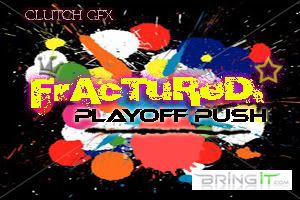
| This is going from top to bottom:
The first I find is really simplistic but it works. Not to much info but the images look crisp.
3.5
The second I think is a little to hard on the eyes. Just a lot of color to process all at once. With varied colors (like paintball splatters) the text over it
somewhat takes away from the idea of it. Again just a little loud for my taste.
3
This third one was definetly my favourite. Graphics are good, the colors flow, and for lack of a better word its "cool". This is the type of logo that any respected team is goin to look for. Well Done.
4.5
The last one, much like the third, is just cleaner looking, has all the right things on it. Graphics are clear but I might have added a different image rather the
turned around soldier, but still very nicely done.
4 | |
|
*-Mr KiiNG SiiCKo-*
Head Designer
Posts : 100
Join date : 2009-06-16
Age : 32
Location : IRELAND
| | Subject: Re: please rate my work... Sun Jun 21, 2009 8:13 pm | |
| k thanx il take ur opinions on board | |
|
Sponsored content
| | Subject: Re: please rate my work... | |
| |
|